tl;dr: Here’s a commented sample project if you’re in a hurry
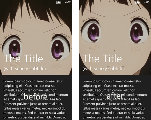
Windows Phone’s scrollviews have a property where if you scroll past the content area, the content is squished. Nokia’s App Social has a cool but subtle effect that takes advantage of this. If you’re looking at a recommendation list within the app and try pulling the list down, you’ll notice that the header image doesn’t scroll with the rest of the list. Instead, it scrolls slower than everything else, as well as expands to fill the space made by the squished scrollview.
If you’ve ever played with an iOS device, you should know this effect well, as it’s present in so many apps on that platform. My favorite example is probably within Day One, an awesome diary app, where within your diary entries you can set a header photo that behaves similarly.
Creating this effect on Windows Phone is certainly tricky for a variety of reasons—in fact, if you play around with App Social’s implementation, you might even catch a few glitches—but with a bit of work you can hack together something like this:
Let’s get to work! Open up VS and create a new blank WP8 project. This might work in WP7 (or even WP8.1!) but I haven’t tested it.
Here’s the XAML we’re going to be using:
1 2 3 4 5 6 7 8 9 10 11 12 13 14 15 16 17 18 19 20 21 22 23 24 25 26 27 28 29 30 31 32 33 34 35 36 37 38 39 40 41 42 43 44 45 46 47 48 49 50 51 52 53 54 55 56 57 58 59 60 | |
Most of what’s in here is pretty self-explanatory, save for a line or two. Don’t worry, I’ll go over those curious lines later.
You’ll also need a rather large header image, of course. If you can’t decide on one to use, feel free to use the one I did. The position and size of the character’s eyes actualy help in demonstrating this effect. No really, I’m serious!
Last, I’d recommending dealing with the system tray in some manner, whether it’d be making it transparent or hiding it altogether:
1 2 3 4 5 6 | |
Let’s now jump into the code-behind of the page. First of all, you’ll notice from the XAML that the image is top-aligned to the top of the page. This isn’t what we want. Instead, we want the center of the image to be at center of the empty space. As far as I know, there isn’t an easy way to do this within XAML (without clipping the image) so let’s do it programmatically:
1 2 3 4 5 6 7 8 9 10 11 12 13 14 15 16 17 18 19 20 21 22 23 24 25 26 27 28 29 30 31 32 33 34 | |
Perfect! Now Chitanda (or whatever you chose as your image) will be centered in the space rather than stuck to the top. This is very important because later on, we’ll be pulling the image down, so we don’t want it to end immediately at the top.

Now let’s get to the actual effect. Although it looks like one smooth effect, there’s actually two distinct parts. We need the image to scroll slowly when being hidden by content (the first part of the video above), and we also need to the image to “expand” when the scrollview is squished (the second part of the video). The first part is easier, so let’s do it first.
We need a way of detecting when the the scrollview is scrolled, and by how much. It turns out that the little scrollbar you see on the right is a good way of checking this. Now normally the scrollbar is buried deep within the ScrollViewer control, so we need some way of fishing it out. We’re going to use the VisualTreeHelper to do this:
1 2 3 4 5 6 7 8 9 10 11 12 13 14 15 16 | |
Now that we’ve fetched the scrollbar, let’s see how we use it:
1 2 3 4 5 6 7 8 9 10 11 12 13 14 15 16 17 | |
That’s it! Now if you scroll the content to read more of it, you’ll notice that instead of staying put, the header image now scrolls along, but slower than the content.
We’re not done yet though. If you try pulling down on the content, causing it to squish, you’ll see that
nothing happens to the header image. You might think that it’s because of the if (e.NewValue > 0) check
we did. But if you remove it, you’ll see that there’s no difference.
The problem is that the scrollbar’s value (as well as a ScrollViewer’s VerticalOffset) doesn’t respond to the squishing effect. It doesn’t become a negative value, which means that we can’t use for the second part of the parallax effect. This is where things get complicated.
The ScrollViewer control has a weird property called Content, which is a UIElement representing whatever you
put inside of it. That UIElement, like all UIElements, has a RenderTransform property. It turns out that when
you squish a ScrollViewer, it sets that RenderTransform to a new CompositeTransform instance. It only does once a squish occurs
though. That means that if you tried accessing Scroller.Content.RenderTransform in our OnLoaded function, you wouldn’t
get a CompositeTransform object. You’d instead get a MatrixTransform, and we can’t do anything useful with that. We’re
going to need to detect when it becomes a CompositeTransform, and the MouseMove event is perfect for that:
1 2 3 4 5 6 7 8 9 10 11 12 13 14 15 16 17 18 19 20 21 22 23 24 25 26 27 28 29 30 31 32 33 34 35 36 37 | |
Awesome, we got our hook! Now, we can use the TranslateY of the CompositeTransform and move our header image just like we did with the scrollbar. There’s a slight problem though.
This method, ScrollerOnMouseMove, will only be called when the “mouse” is moving within the ScrollViewer. There’s one case that it doesn’t handle: when the user squishes the content and then lets go, letting the content spring back into place. ScrollerOnMouseMove won’t be called then, so our image will never slide back into place.
We could use the MouseUp event for this to snap the image back into place, but that’ll be a harsh snapping instead of the smooth sliding that we want.
Instead, we’ll recall that the TranslateY property of a CompositeTransform is actually a dependency property, which means that it can be binded to:
1 2 3 4 5 6 7 8 9 10 11 12 13 14 15 16 17 18 19 20 21 22 23 24 25 26 27 28 29 30 31 32 33 34 35 36 37 38 39 40 41 42 43 44 45 46 47 48 49 50 51 52 53 54 55 56 57 58 59 | |
And now we’re done! For real this time! If you pull down on the content, squishing it, you’ll see your header image slowly slide down to fill the space. And if you release, the image will slide up with the content.
All is not perfect in the land of Windows Phone though.
I mentioned way back in the beginning that there was a peculiar line in our XAML that I’d discuss later. That
line is ManipulationMode="Control". See, by default the ManipulationMode of a ScrollViewer is set to “System”.
What this amounts to is that scrolling events are optimized and reports are chunked to get the smooth scrolling
Windows Phone is known for. Setting it to “Control” throws some of these optimizations out of the window, but it’s
the only way we can get accurate values for the scroll offsets. If you try setting it back to “System”, you’ll see
that our smooth parallax scrolling becomes chunky, and in the case of handling squishes fails completely.
You’ll have to settle for the (albeit slight) performance decrease if you want this effect—you’ve probably already noticed that sometimes the header image stutters. You’ll also have to settle for some sporadic bugs that I’ve noticed, including the ScrollViewer getting “stuck” in the squished state, or it jumping to the top or the bottom if you flick randomly.
If you’re okay with it though (or you find some way to further optimize this, please tell me if you do!), this is a really nice looking effect, and it honestly isn’t a ton of trouble to implement.
If you don’t feel like copy-pasting all of this code and organizing it yourself, you can download a fully-commented example here: https://github.com/y2bd/WPParallaxScrolling
Here are two articles I used when figuring this out:
